


I try hard to focus on the positive aspects of this project taking so long to complete, and one of those has been the advent of new technology which enables me to use improved techniques in creating the imagery and style of animation for The Price. This week, I thought to share an example of this by using the logo sequence for my production company, Silver Fish.
(Sidebar: my youngest son asked me the other day, “So…where did you get “Silver Fish” from anyways?” He said this in a tone that was either mild disdain, or one of entreaty, as in: “Please don’t launch into a 24-minute explanation…just… keep it simple.” I took pity on the wee-lad, and said, “Well, you know I like the color silver…and our last name is Salmon, so…”)
Below is the original sequence that I developed for the Kickstarter pitch video, and have used at the beginning of the Video blogs you can find here on the site:
The image of the fish (a stylized hybrid of the Lion and Anglerfish breeds) had been designed as a simple, 1-color graphic in Adobe Illustrator, then painted to give it dimensions and a metal-like appearance in Photoshop.
![]()
That piece of 2D artwork was taken into After Effects and warped to create the “biting” animation and some slight movements in the body to give the impression of it swimming. I then used particles and simulated volumetric lighting effects (a fancy way of saying “beams-of-light”) to make it seem as though it was all situated deep in the mysterious, oceanic depths somewhere.
With editing and sound design, the final piece had a playful/foreboding feel that was darkly whimsical, which was exactly what I was going for.
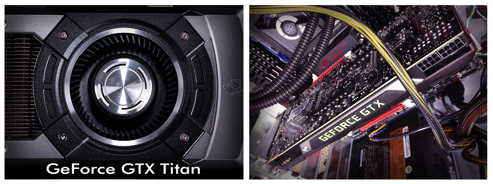
I use After Effects a lot in my work — I pretty much live there — so I was thrilled when a new plug-in for that program was released by Video Copilot, a 3rd-party developer lead by Andrew Kramer (an extraordinarily gifted teacher/tutorial host who is genuinely fun to listen to, uncommonly generous with his knowledge, and is also an all-around good guy). The plug-in is called Element 3D, and it allows me to bring actual 3D models into After Effects and utilize the power of advanced video card technology (also called the Graphics Processing Unit or GPU, and is the part of your computer’s guts that make video games looks so pretty). I have a real monster of a video card, a GeForce GTX Titan; take a look:
Element can let you see your model in real time rather than having to wait for hours until it “renders” a finished image. While this real-time method doesn’t have all the über-deluxe bells & whistles that traditional 3D rendering programs offer, the advantages of immediately seeing if the lighting is right or moving things around in a scene to get the composition I’m after is hard to overstate.
So, starting with the same initial Illustrator logo graphic, I created a 3D version in Element (extruding and beveling the fins, teeth and main body of the fish), and textureing them with some of the professionally created materials (or “shaders”) available from Video Copilot to simulate scratched and worn metal.
![]()
Once this stage was completed, I could actually animate the 3D jaw snapping shut while the fins flared & undulated and the eyeball flicked back and forth, as if searching for more prey…
Putting it into a new shot with animated surface “water” and a rock-strewn sea bed, more particle “floaties” and those omnipresent light beams, I was then able to animate the camera to show the actual 3D nature of the fish, rotating around and then pulling away after it attempts to grasp the virtual lens in its metallic maw. Check it out:
I added camera shake, bubbles, and motion blur (an artifact from real camera film exposures that cause fast moving objects to blur, and to which we as an audience have become accustomed to seeing; when we don’t, something about the shot doesn’t feel “right,” or seems “fake”) to heighten the impact, and even made some water distortion occur when the letters zoom the past the camera to form “Silver Fish.” I chose to have the word “Productions” appear in a more dynamic fashion and in a contrasting color for emphasis (I like the color orange quite a bit as well). The whole thing was then taken into Adobe Premiere Pro for editing and adding the sound effects — the process of putting all of the carefully crafted pieces together, which I enjoy immensely.
By comparing the two logo sequences, you can see how much more may be realized; it could be argued, of course, that both are equally serviceable (true enough), but I am vastly more pleased with the second. To me, it feels much more dynamic and epic in scope — and being enabled to add both increased dynamics and a broader sense of scope to the world of The Price can only make it an even richer cinematic experience.
I hope this was interesting and not too technical (it certainly wouldn’t qualify as one of my son’s preferred types of answer); enjoy your week!

Very cool! The new one is excellent … has an added depth to it, a lot more punch.
Wanted to drop by and apologize for having been so absent lately. Have been kept unbelievably busy between school, work, and personal life of late, and just haven’t had the time to come around and check on things as much as I’d like. But really glad to see all the updates, and still excited about the project.
I think finally seeing the end result will be a bit of emotional ordeal for me … and explaining that comment is perhaps a touch more than I should burden you with here, but suffice it to say I haven’t had any time or energy to devote to my writing career lately, and it’s been a long time since I’ve done any reading for pleasure (or as a balm to emotional wounds). Every time I think about your project, and of course the story itself, I feel almost as though I’m looking back on a lost part of myself, something better that I had striven for and been unable to attain. Sitting with you at the screening will be, I suspect, something as humbling and melancholy as it is cathartic. I think I am wary of that day and what may go on internally for me; yet I know too that I need that day. My contribution to the project was born of some emotional decisions during an emotional period of my life, and when I’ve thought about your film over the last few months, I discovered there was more of me invested in what you’re doing than I perhaps realized. There’s an aspect of this that I have isolated for myself and walled off from the project at large, and I’m not quite sure what to make of that. But I think it says a lot about the work you’re doing that it can feel so personal to me despite not being at all my own.
Very much hope you’re doing well, friend. Have missed reading your updates and return comments, so will make an effort to be more diligent about keeping up in the future.
Mr. Riser!!! So very glad to hear from you Michael; as always your words resonate deeply and I want you to know I’ve been thinking long & hard on what to say here…and as a result, I’ve come up with a very long answer (which I am going to email to you directly). Stay tuned my friend…
Ever thoughtful. I look forward to it!
Very nice. I really liked the original. The new one is even better. Feel free to go into as much detail as you want with this stuff. I eat it up.
Hey Michael — thanks, my friend! I haven’t talked with you in awhile; hope all is well!
I love this–it’s much more dynamic and punchy, more professional even. A bit of fourth wall breakage that makes one jump, in a good way (“holy crap the fish is gonna *eat me!*”) 😉
Thanks Court — great to hear from you!