


Greetings & salutations, everyone! Yet again, it has been too long between updates, so allow me to share a few comments to let you all know that both The Price and I are still alive and kicking.
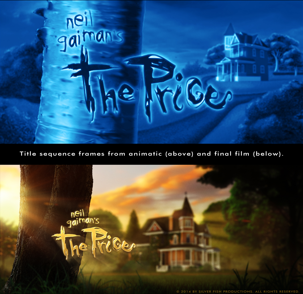
I thought it would be interesting to present an example of how a finished scene has evolved from what I had originally created in the animatic. Since it was the first shot I worked on back when trying to establish a look for the rough “blueprint” (literally) of the film, let’s take a look at frames from the two versions of the opening/title sequence:
Space
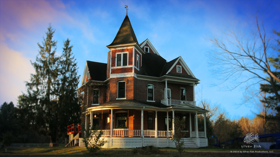
One of the first things I realized during my visit to Castle Gaiman (once I began to get my ‘giddy-awe’ under control) was how the east-facing side of the house had far more visual interest to me than the west-facing…which of course was the side I had featured in the animatic. Now, I have said before that I’m not attempting to re-create reality, nor do I feel limited by what I have seen in visiting Neil’s marvelous abode, and yet I couldn’t help but be inspired by things I hadn’t thought of or imagined. After some contemplation, I decided to reverse the orientation of the house, but it took awhile longer to fully appreciate how making that one change would involve much more than simply moving the camera from one side of the scene to the other; in fact, the impact of this adjustment was felt in almost all of the shots that follow it!
If you look at the basic composition of the animatic version, the house is rather far off in the distance on the right-hand side, with the tree (bearing the engraved symbol that becomes the first letter in the title treatment) on the left. Flipping the house meant it would face the right of the screen, and I liked that the antagonistic forces would now be approaching from that direction, going against the familiar left-to-right flow to help establish tension.
But doing that made me want to put the house on the left hand side of the frame…and that wouldn’t work since the tree needed to be on the same side to allow the title to extend to the right of the trunk…
Hmmm.
It took some juggling and much trial and error to come up with an alternate layout that worked with the camera motion of the shot (the frame you see is the third and final stage of that motion), and conveyed a cozy, ‘nestled’ sense of the house being protected by its environment, rather than projecting an encroached-upon or claustrophobic vibe.
 Color
Color
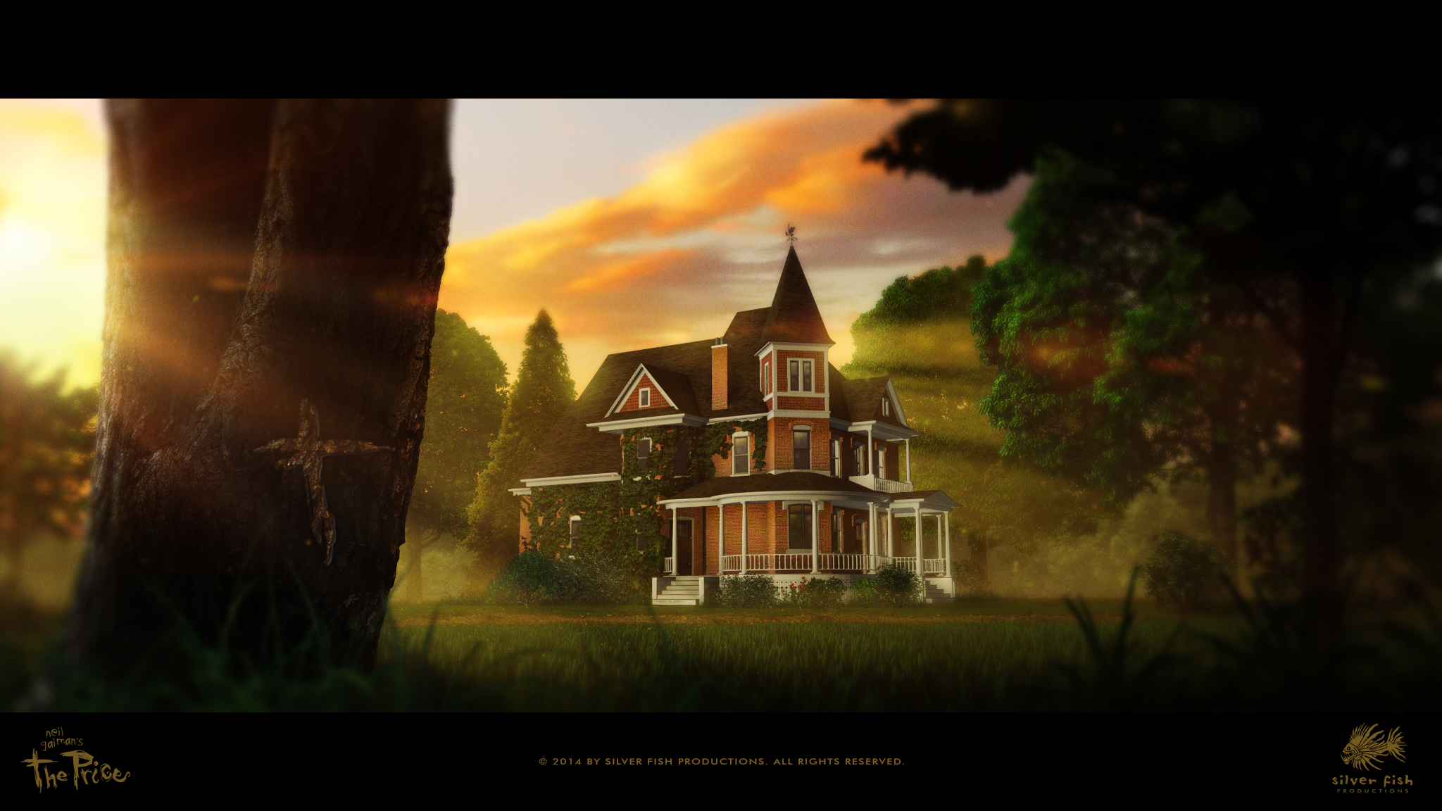
Early one morning , I set up my camera to capture a time-lapse sequence of the house during sunrise. While the shutter clicked away for the better part of an hour, I went for a brisk run along the roads that weave throughout the rural Midwestern landscape; as I made my way back to the property and glanced up at the home, I was stuck by the rich warm reds of the brick in the golden light. Immediately, I wanted to use those colors to establish (from the very first moments of the movie) that this place was one of goodness, warmth and of great value — worthy of protection and preservation. Once again, this was vastly different than limiting myself to the monochromatic blue-tones I had used previously — color changes everything! It is a powerful tool, and although I had been debating the merits of full color versus the “blue & white” scheme of the animatic (that many viewers mentioned was a compelling choice), the allure of what color could do to help tell this story won out in the end.
Light
Light is incredibly effective in leading the audience’s attention where you want them to focus, notice certain details, or to create a sense of depth and space. In this shot, using rays of sunlight and the diffused layers of early morning haze helps to separate the house from the background; keeping the foreground tree wreathed in shadow sets it apart from the other elements and lends an air of mystery or menace.
There were many other considerations, especially with the camera’s movement itself. At first, I had it set up to be very smooth and precise…too precise, actually. I decided to give it a slight ‘wobble,’ almost as if a real cameraman was filming the scene with a Steadicam device (which often adds a neat, ‘floaty’ feel to a shot), and suddenly, it all felt more alive and intriguing somehow.
For those so inclined, below is a full sized frame from the opening scene of The Price you can download and use as a desktop image.
Hopefully these comments make some kind of sense; I find that a lot of the time — when those peculiar, artistic voices start suggesting things in my head — I can’t really explain “why” I made a particular decision or provide the rationale behind a creative shift in direction. As Peter Chan (an amazing concept/visual development artist who works in both the film & game industry) recently stated at the Game Developer’s Conference in San Francisco, when your “Gut” tells you to do something, you have to make the choice to listen to it instead of to your “Lizard Brain,” that part of your mind that always wants to play it safe and logical; I wholeheartedly agree.
So until next time, keep those creative impulses flowing and ignore that Lizard Brain!  And if by the slightest-of-chances you have never seen Mr. Gaiman’s hugely inspirational speech given at the University of the Arts (or if you just really need a boost & want to watch it again), here you go (and you can thank me later). Enjoy!!!
Neil Gaiman Addresses the University of the Arts Class of 2012 from The University of the Arts (Phl) on Vimeo.

As always, interesting visuals.
Do you have an estimated completion time for this project?
Glad you found them of interest! 😉 All of my estimations have proven to be wildly inaccurate thus far, so I’m afraid you’re just going to be happy with knowing I am doing my very best & will be finished as soon as I can.
Hi Christopher. Nice to see an update. I know its hard to keep us in the loop without previewing too many visuals from the film. I just wanted to say I’m still really looking forward to the day my backers copy comes through my door, keep it up, the updates really help with keeping my faith in the project alive, even if its just a quick note to say hi or how your doing etc. its all good.
Thank-you Mark! It will never be a question of “if” it will be finished, only “when,” so your faith in the project is not in vain! I appreciate the kindness and am glad you enjoy the updates.
It is always exciting to see another update….and this one has really made my day! Really love the way you are using light and color to establish the mood and feeling of the house. Very effective, as well as beautiful. Always great to hear from you, and glad things are going well.
Thanks so much, Sandra! I am very pleased you find that shot beautiful; it really is a magical place, and I hope viewers will be able to identify with The Black Cat in wanting to keep it safe & secure.
Great to get an update, and love what I see. Have actually been thinking about you often lately and wondering how things are going. I should really attempt to keep in better contact, but things have been busy over here … lots of work, manuscript stuff, school stuff, and Diablo 3’s Reaper of Souls (the bane of my productivity).
Anyway, great to see what’s happening with The Price, but do let us know how YOU’RE doing, too, Christopher! After all, I think many of us invested as much in you as in your project, and it would do my heart good to hear things are well with you.
Hey Michael — always such a pleasure to hear from you, my man! I am doing well, and struggle like you with finding the balance between all of life’s competing elements — except that I don’t have to contend with the spawn of Blizzard Entertainment. 😉 A full-time job (that always seems to run into “crunch mode” despite my best efforts), a wonderful family, activity in our church and neighborhood, and then this particular labor-of-love all manage to keep things hopping around here! Our family has gone through substantial change this past year, going from 5 kids at home to only 2; that shift in addition to our son Jordan’s passing has caused some Teutonic shifting to the familial landscape, but that seems to be the way life works, doesn’t it? It’s a dynamic, malleable thing, and we just adapt and do our best.
  Your considerations are deeply appreciated, and I sincerely hope things are going well for you in your own busy schedule!
Thanks for the update, as I’ve been wondering for sometime. The Price is still my favorite short story, and I hope I get to see the movie. The castle looks magical in the sunrise. Keep it up, please!
It’s my favorite short story as well, so don’t worry — more is on the way & quitting has never been an option!
The visuals look absolutely stunning, I can’t wait to see this in motion, with sound, narration and music.
As an artist, I know there is no rushing art, but do you have any sort of time perspective on this project at all? I mean, are we talking years, months, weeks…?
In all honesty, I can’t say for certain, Jon. I want it done before October so I can qualify for submissions in Sundance and possibly the Oscars, but I have learned that Life sometimes has other plans. Please know I will continue to do all I can, given the conditions I mentioned in response to Michael J. Riser’s comment above.
I love seeing the thinking behind scene choices.
Thanks Molly; I’ll be trying to share these types of examples more often.
I really enjoyed reading about part of your creative process. Makes me want to try new ways in which I can be more open, and integrate what the world outside of the work is telling me.
Meanwhile, every step forward is in itself a huge milestone. Thanks for the update.
Hey Trevor — so nice to hear from you again! It has always been my hope that others might find what I’m going through to be helpful/inspirational in solving their own creative quandaries!
Hi Christopher, thanks for the update (I’m a little behind!) I really love seeing the comparison of original concept to what the film has developed into. Creative process is fascinating; I love seeing how it works for other creatives! Quick question (sorry you’ve probably answered this a million times!) will your original animatic feature on the DVD? I’d love to see ‘both ends’ of the project.
There is something quite special about your choice of colour – I thought that before reading on about the visit to Castle Gaiman – now it makes perfect sense why it works so well. A brave and good creative decision. Very best of luck with the remainder of the project – what are the next steps? Very best wishes for you and your family too. Natasha
Thanks Natasha — I’m always amazed how wonderful comments like yours arrive exactly when they are needed most! Yes, the plan has always been to include the animatic on the DVD/BluRay as a bonus feature, but I will have to swap out the temp soundtrack for the final score (as I don’t own the copyright for that). I agree, seeing the creative process is what I enjoy the most about “behind-the-scenes” extras. I also appreciate what you said about the colour (I’m Canadian, but I adopted the American-ized “color” I’m afraid…part of an early childhood rebellion that occurred while watching this new TV show from “the States” called Sesame Street.); looking at that house was spellbinding enough, but it was absolutely stunning in that early morning light.
As for next steps, things have changed significantly over these many months regarding the way to best use the assets my team has created. I’ll be trying to explain a little bit more about this process in my next post, so don’t give up yet — I haven’t!!!
Hey Chris, that shot (and the 3d model) of the house is stunningly beautiful. When I first backed this project, I was expecting it all to be blue/grey-scale and I was perfectly happy with that, getting more and more excited now after seeing what it is becoming!
Keep up the excellent and amazing work, we will all get to the finish line sooner or later.
Sincerely,
-Dave
I appreciate your saying so, Dave. I struggled for some time with the notion of keeping the monochromatic scheme, but there was so much that could be conveyed with color that I just couldn’t resist (especially after seeing the actual house in early morning light, with the golden rays imbuing its deep red brickwork with such vivid hues — far too delicious)!