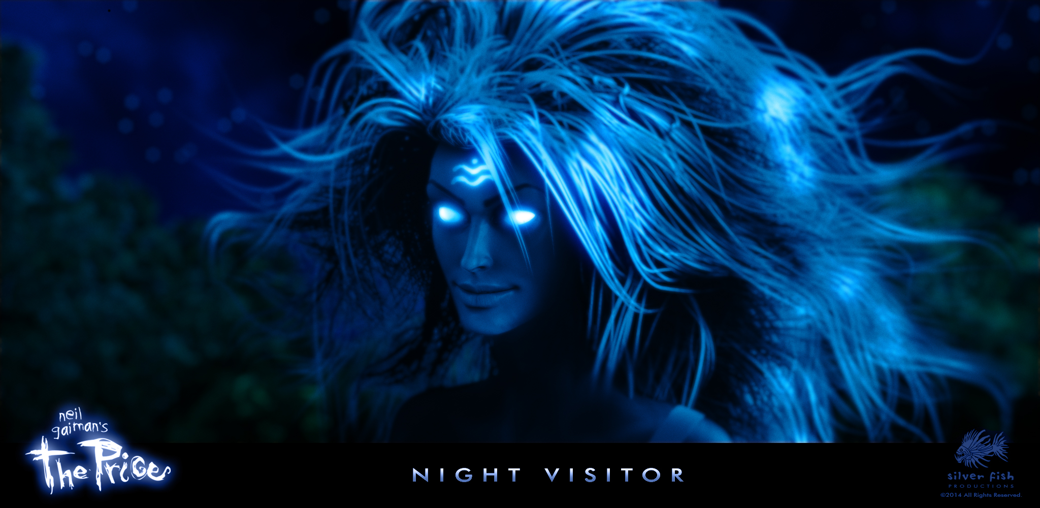
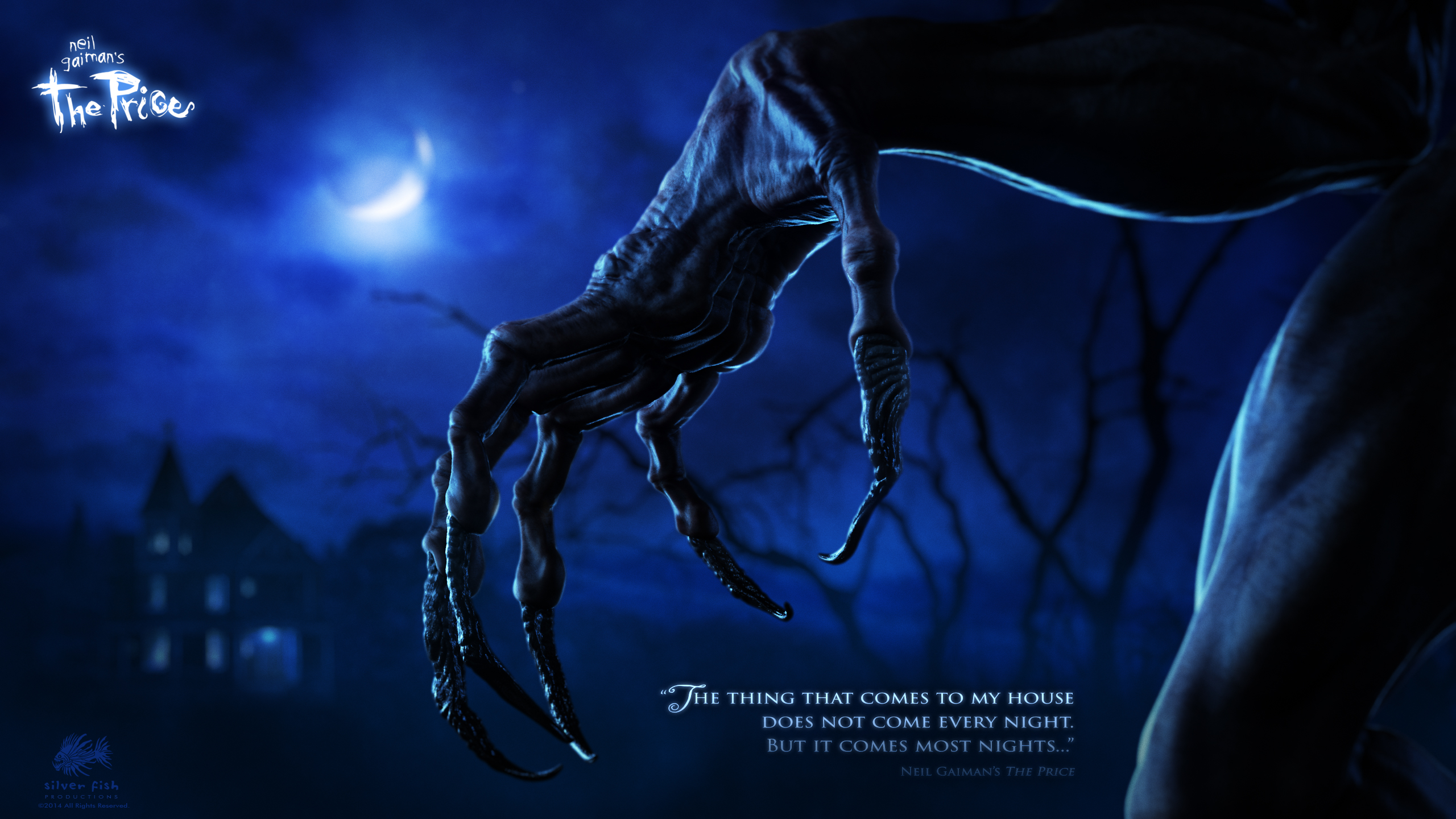
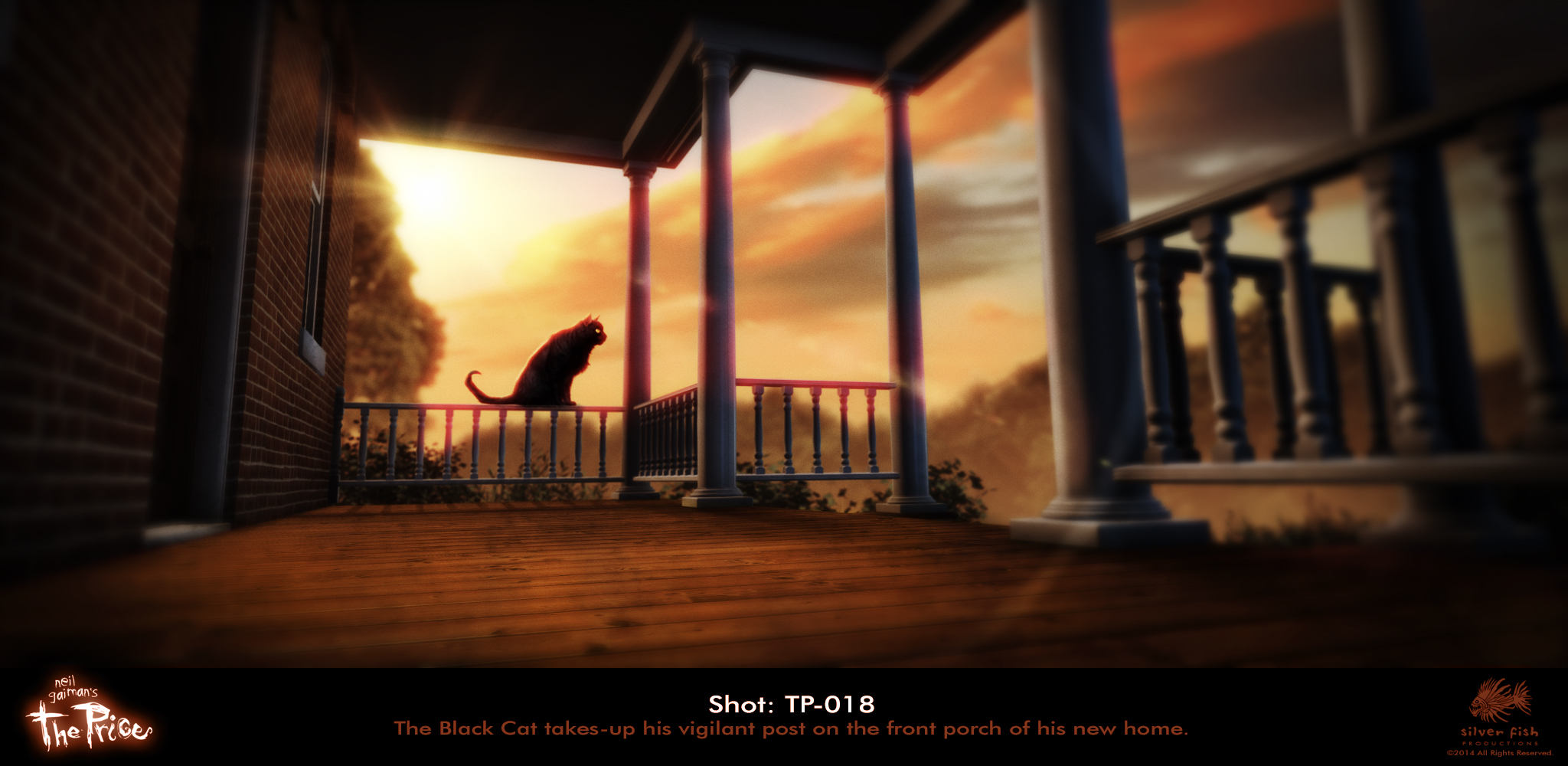
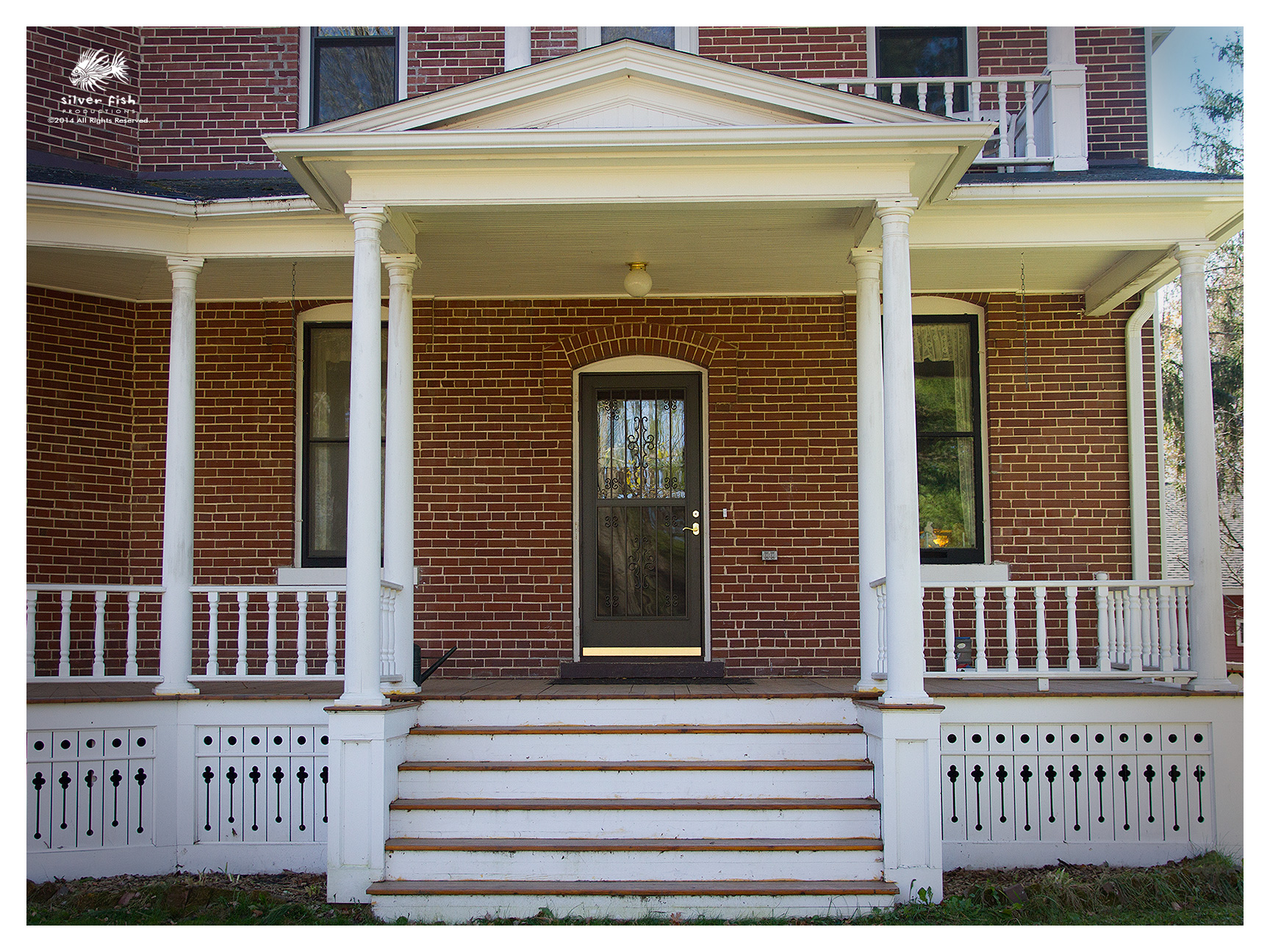
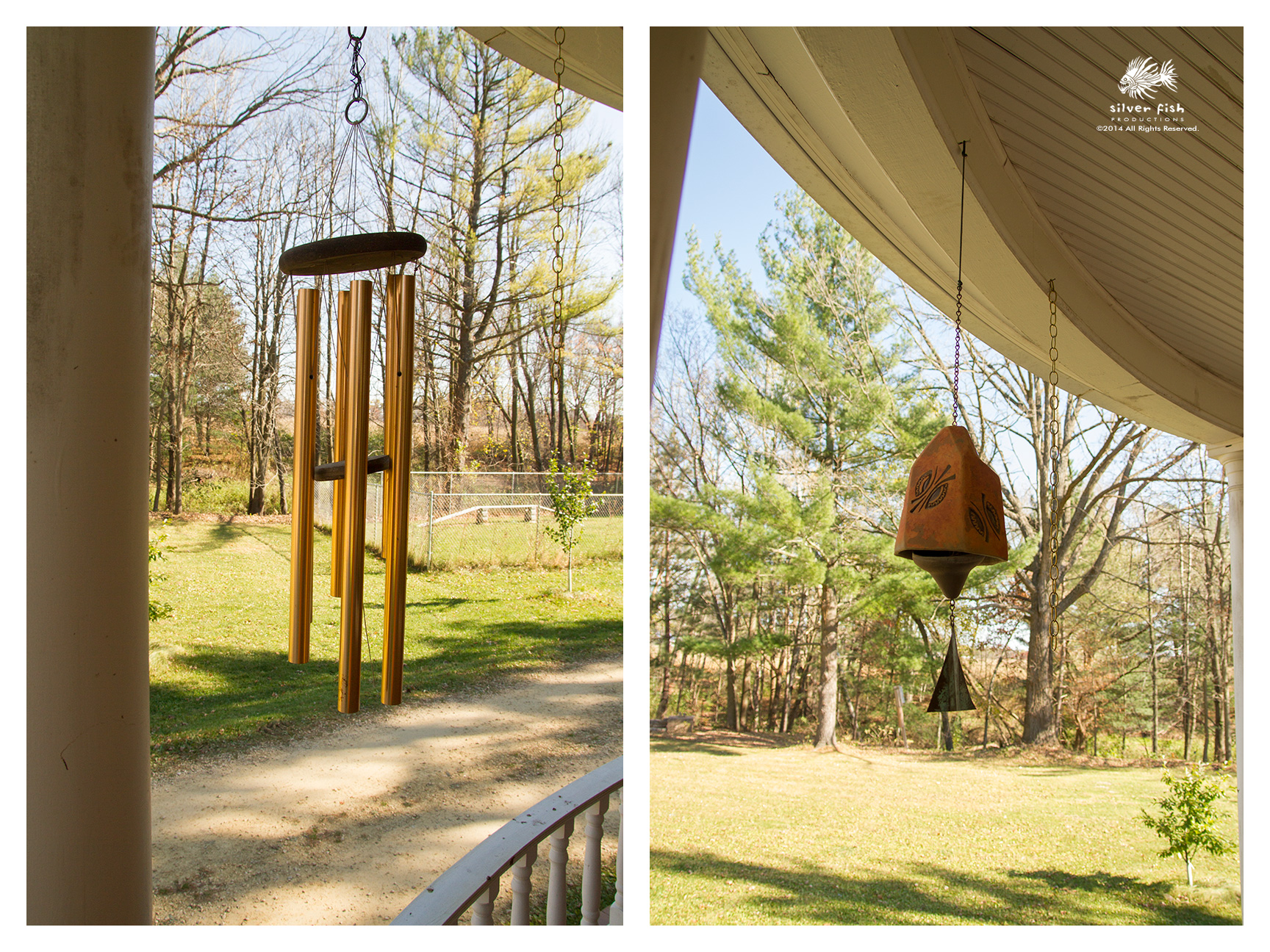
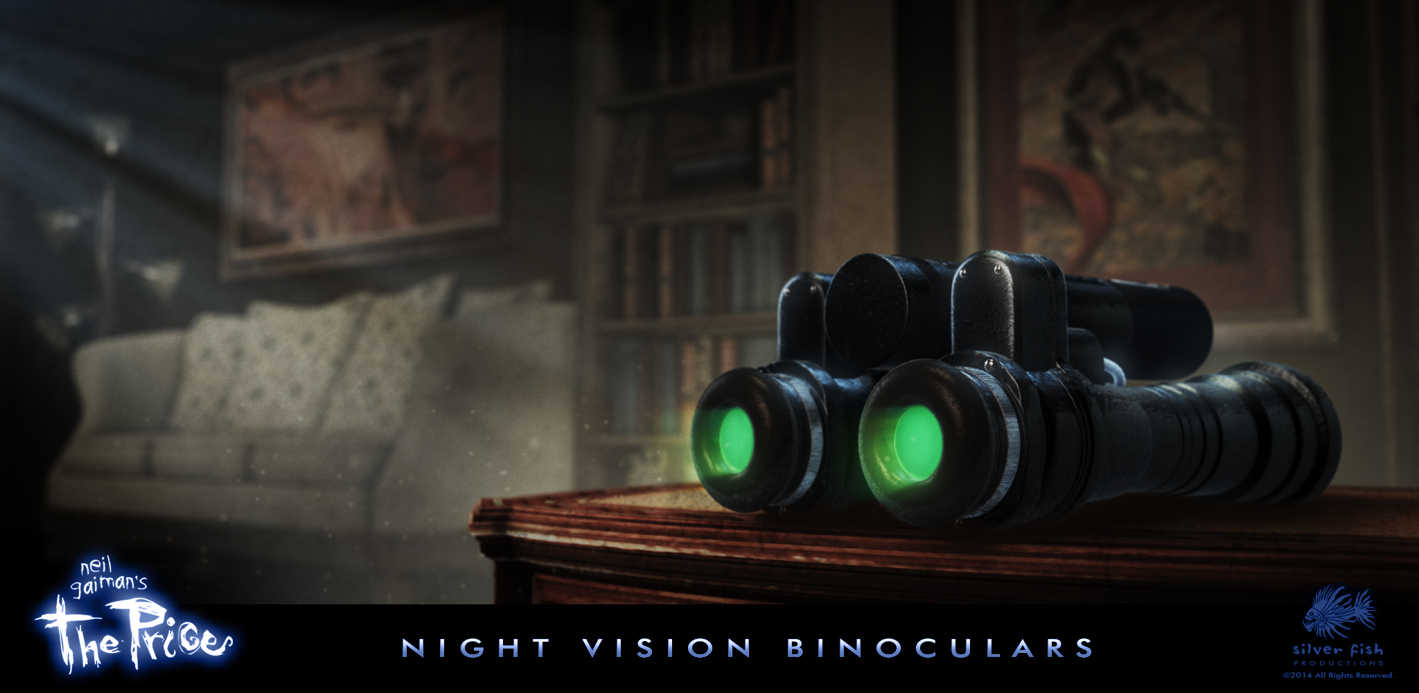
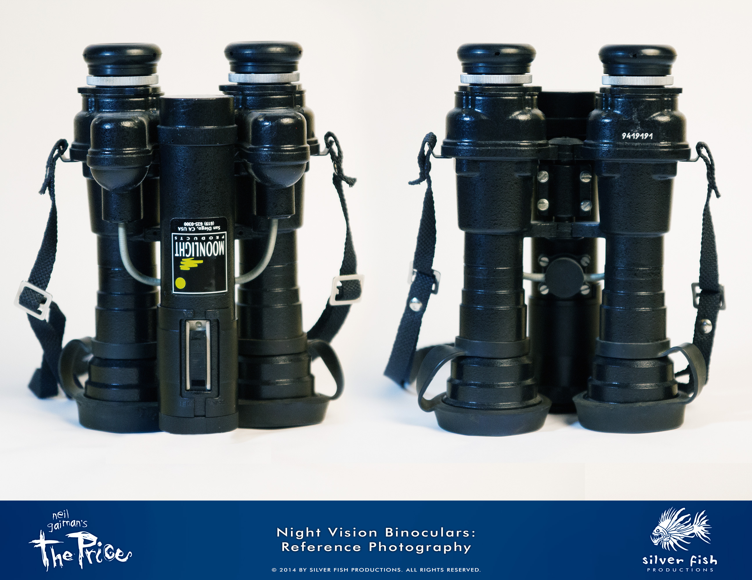
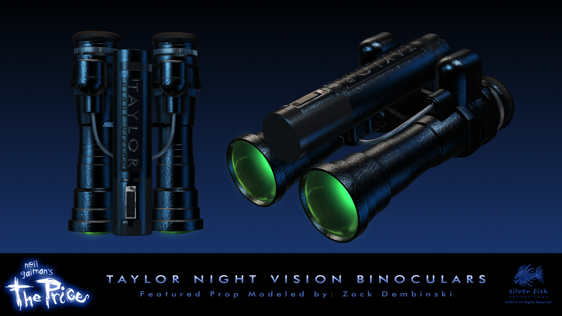
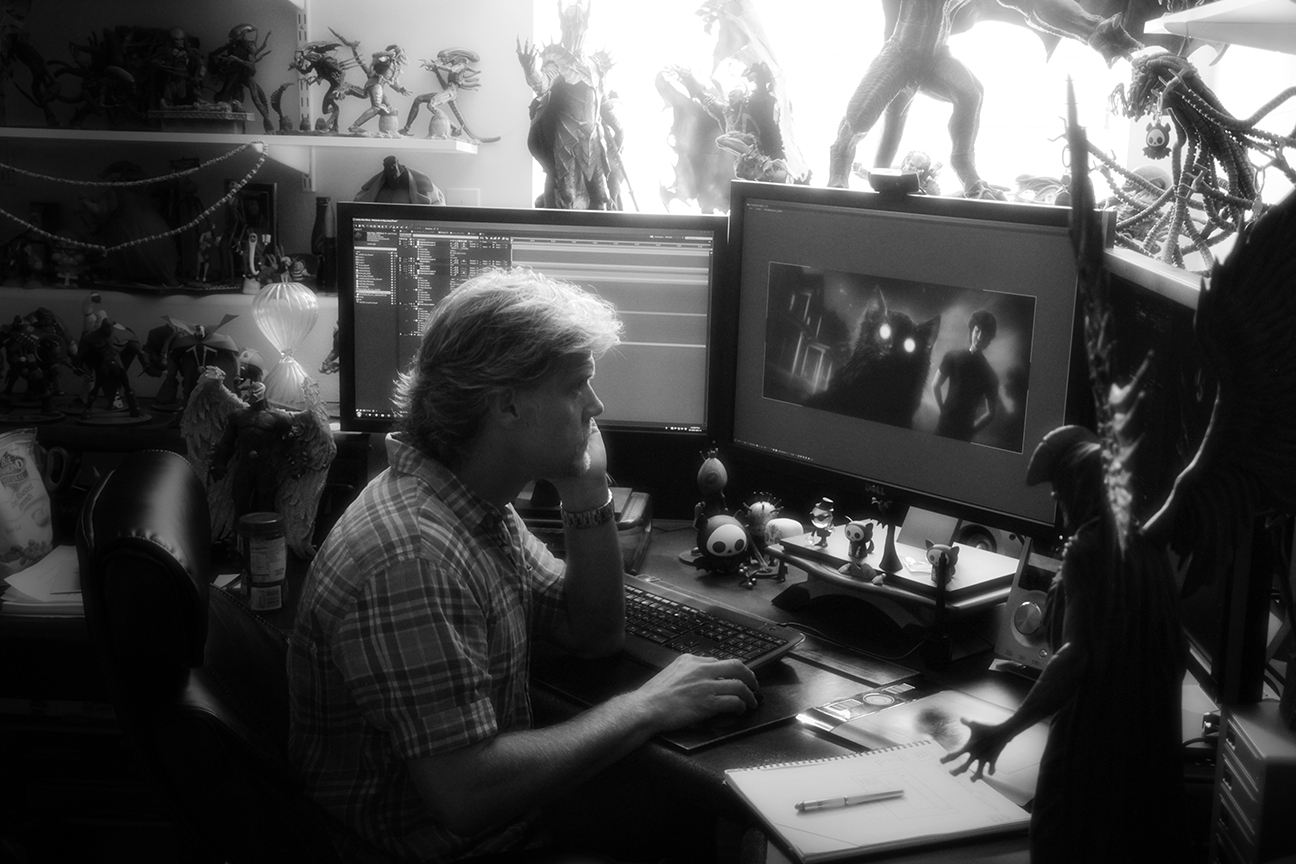
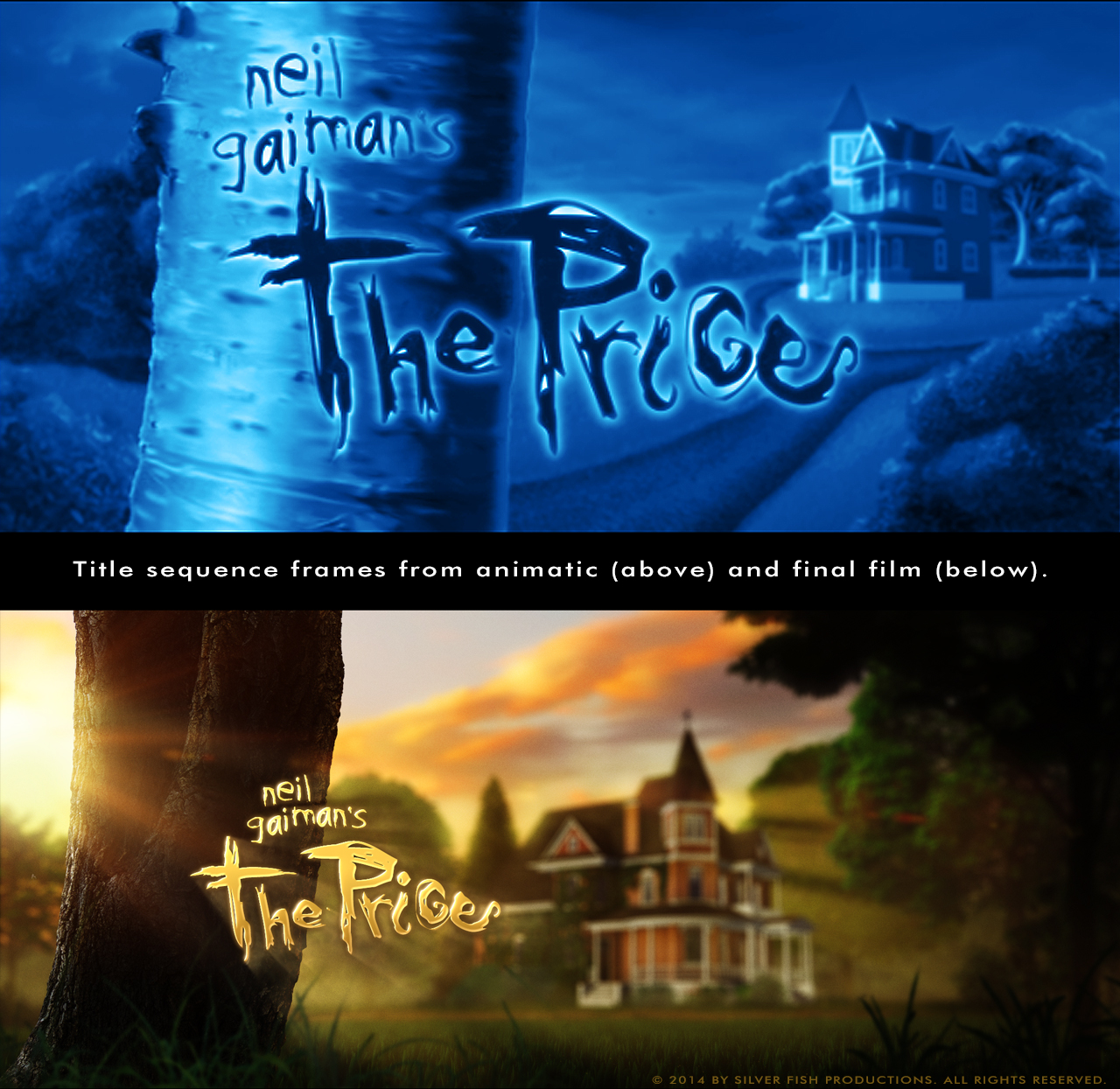
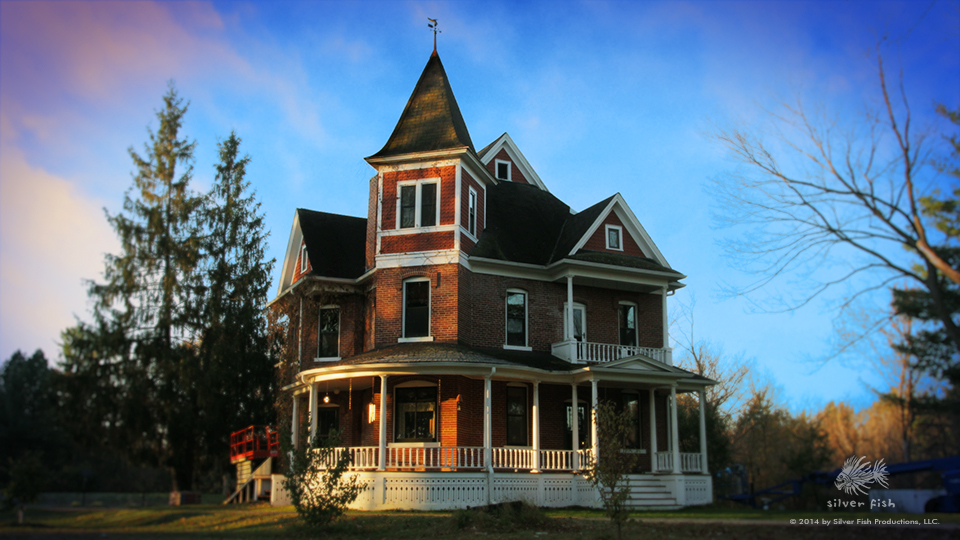
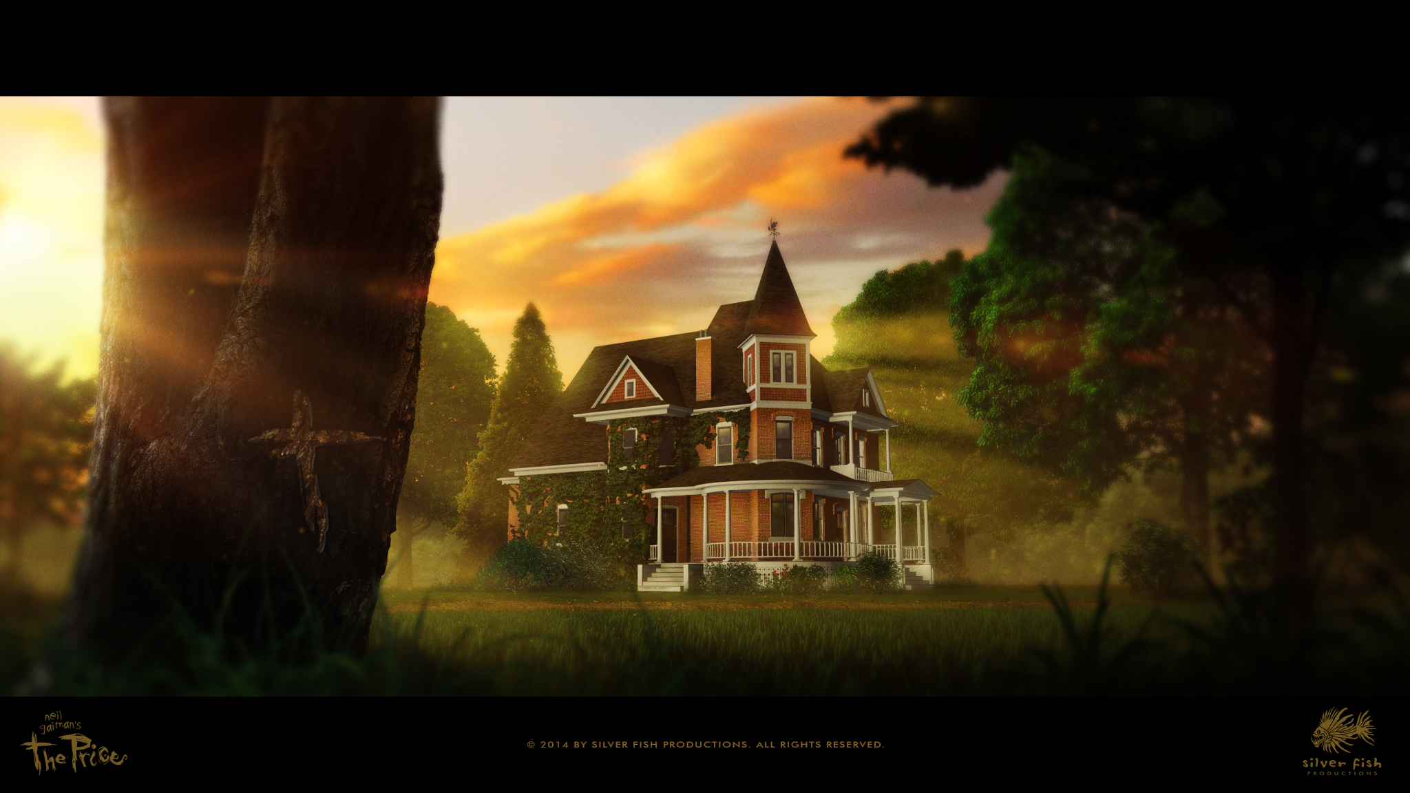
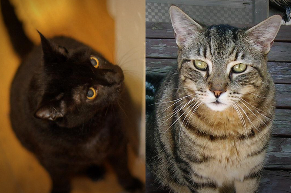
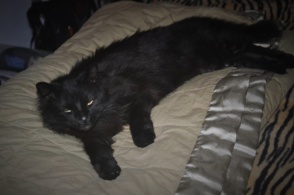
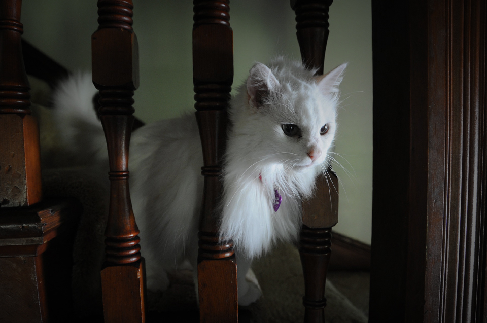
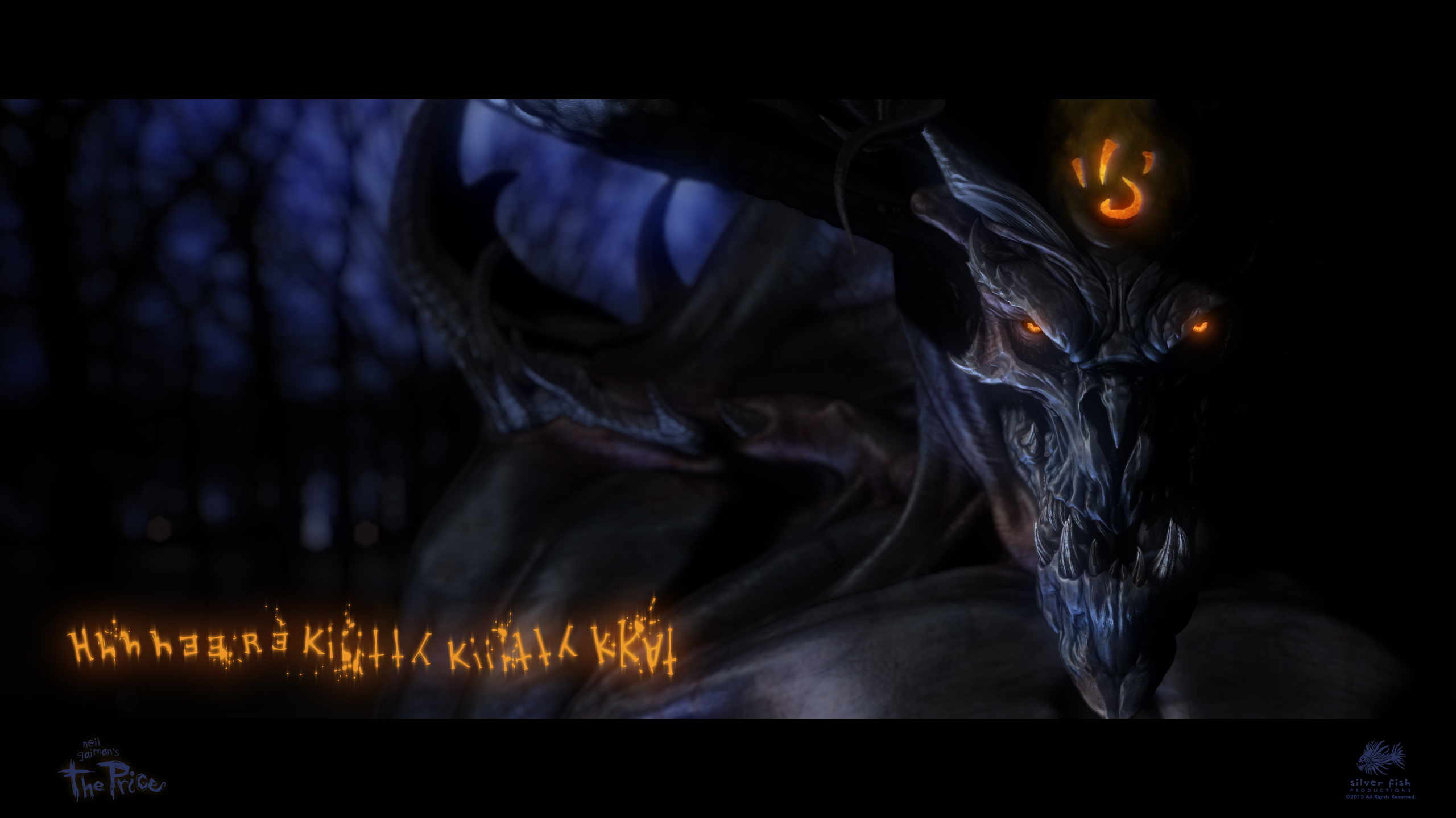
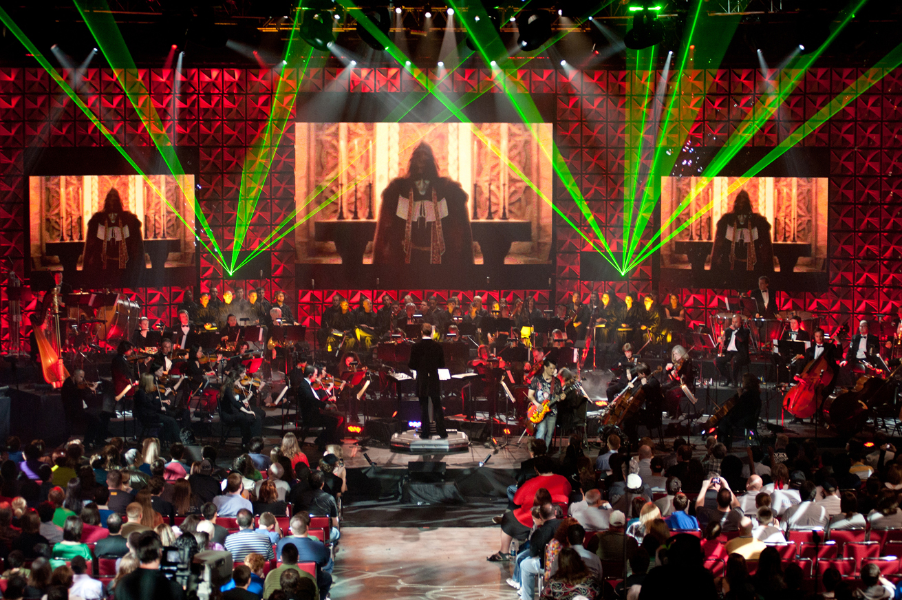
First off, to make up for not posting anything for a couple of weeks, here is another creepy image to keep you in the All Hallows mood:
Speaking of, you should definitely stop by All Hallows Read and watch Mr. Neil Gaiman explain how you can join in the fun.
I recently read a comment from one of my new friends (who is also a backer for The Price) expressing his sentiments about not yet having reached some of the creative goals he has set for himself. In trying to find a helpful way to respond, I got to thinking of several instances while pursuing various creative endeavors of my own when I felt threatened by the dangerous notion that I wasn’t making the kind of progress I’d hoped for in realizing my potential (despite consistent efforts to do so). I can recall moments of feeling a distant strain of jealousy for others who had seemingly attained their artistic ambitions — that had somehow made it past the gate that was keeping me out, and were now running for the far fence at top speed. It’s almost a literal ache inside that draws my attention to a void clamoring to be filled and I can’t let it go. I’ve been wondering why we sometimes have to contend with these kinds of feelings and what causes them.
The answer I keep coming back to is this: our dreams don’t die.
I’m not sure where they come from initially, but after all I’ve seen up to this point in my life, it appears that they don’t ever fully dissipate. To illustrate this in any kind of meaningful way, I’m going to have to tell you a rather lengthy story: mine.
I saw 2001: A Space Odyssey at the age of 3 (reportedly), and as far as I can remember, I’ve always loved movies and wanted to make them one day…but how? That was the ever-burning question for me growing up (and still is, really).
I began by teaching myself how to draw the things I was seeing in my mind’s eye. It wasn’t long before I wanted to make the monsters and spaceships on my paper more “real” somehow; I read as many books and magazines as I could find, and this lead to model building (space ships with kit-bashed exterior detailing and tiny “grain & wheat” bulbs inside the engine exhaust vents that couldn’t be turned on for too long or they’d melt their plastic housings) and making rubber masks. Using oil-based modeling clay, I first tried to re-create a “Planet of the Apes” character. With exceedingly crude sculpting techniques I fashioned a simian likeness, poured plaster over the entire thing to make a mold of it, dug out the clay, then sloshed-around some liquid latex, carefully following the rudimentary directions I’d discovered in the back of an Elementary school library book. I could barely stand to wait until it dried fully before peeling-out the quivering result of all of those long hours of trial and error; but looking at it — an actual rubber mask — I thought it was still pretty neat (for a first try)! Then, peering more slosely at the off-white surface, I realized I had absolutely no idea what kind of paint might stick to rubber without cracking off the minute it flexed (my simple text plainly wasn’t of any use). An albino ape, perhaps? I sighed and resigned myself to having only a partially-finished ape creation sitting on my bedroom shelf until such time as I could discover a solution. (I wouldn’t have an Internet to search through for another 25 years or so.)
Of course, I had attempted to make films featuring these creations using the now clichéd Super 8 camera (thanks JJ) that my Dad kindly allowed me to borrow appropriate. Mostly pitch-black/out-of-focus, these 2-and-a-half minute “epics” were dishearteningly distant from the visions my head was showing me, and I knew there must be a better way.
Incredibly, my high school (and we’re talking all the way back in ’81) actually offered a Television Production class. Complete with bulky, Panasonic 1/2″ camcorder units and Sony 3/4″ editing bays, I began a new era in my creative mania. Most of the “movies” I made during grade 11 & 12 (as we say in Canadianese) centered around some special effect technique I’d figured out — like a chest-bursting alien fetus, or pulsating facial tumors that cracked open and bled on camera — you know, those kinds of uplifting, life-affirming things.  I would stay late after school, sometimes far into the night trying to get these big, clunky machines to edit on the exact, specific frame I just needed to cut on; once, I left the editing room and went upstairs into the main hallway to get a drink from the water fountain only to be blinded by a police flashlight aimed directly into my face, with the requisite gruff voice warning me to stop moving and explain what exactly was going on! (Unbeknownst to me, the janitors had all left hours ago and dutifully activated the school’s alarm system — which I had apparently triggered twice already that same evening while slaking my thirst.)
What can I say? I just kept going.
Fast forward several years later, past a failed marriage and multiple failed attempts at trying to get into the film industry one way or another. I had done FX work on several movies far too crappy to name (well, one was so crappy, I just have to mention it: Troll 2, also known as The Best Worst Movie). I had tried pitching some of my own script treatments (complete with 1-sheet poster mock-ups and creature maquettes) to legendary low-budget movie mogul Roger Corman without success. (The day I arranged to meet with him, his mother fell ill and I was left with trying to impress some exec who seemed intent on getting me out the door as quickly as possible. Nice.)
Thankfully, my second crack at marriage was a game-changer, and many of life’s pieces started to fit together in new and exciting ways. I had gotten involved in the videogame industry, and began to see a potential in digital film production that appealed to me, especially with animation. I worked on several games, sometimes putting in absolutely insane hours for weeks on end until I wound-up sick as the proverbial perro. I learned as much as I could about non-linear editing, sound design, graphic design, 3D modeling and animation, and a million other ancillary things.
One day, I bought the book Coraline for my daughter, and worried that it might be a little too scary for her (but secretly, I kind of hoped it would be), I read it first. And I was astounded. Enthralled. Agog.
This — what’s his name? Neil Gaiman? — wrote something that was scary, funny, triumphant, haunting, and yet was actually uplifting and affirming as well! How was this even possible? I had been searching for some way to have my monsters, but not drown in horror, darkness and despair at the same time…and here it was, fangs and all!
Within minutes of Google-ing, I was crest-fallen to learn that the property had already been given to Henry Selick (of A Nightmare Before Christmas fame) even before the book had been published — geez!!! Henry is an awesome guy, however (apparently, he likes my hair); I just wanted to be the one to make that movie, you know? (Insert sound of a single, large bubble popping here.)
Then a few months later, I was asked by a friend in the home video division of a major studio if I could create a short animated film for a national client to use as an “exclusive bonus” to be bundled with one of their upcoming DVD releases? Given the budget he mentioned, I thought it was indeed possible, and when I looked over the list of new film titles, Mr. Gaiman’s name popped-up in connection with two of them. This got several wheels spinning at very high speeds…
Upon a rapid search through Neil’s repertoire of short fictions, The Price came into sharp focus, and hasn’t left the scope of my attention since. (Needless to say, the deal with the big studio never went anywhere, and the story of finding a way to finally make this movie took several more years of twisting and turning before finally connecting with Kickstarter and over 2000 new friends!)
So, why am I sharing all of this backstory? To demonstrate my point, that once they spark into vibrant, flickering life and fill your mind with the light of glorious possibility…those dreams don’t abandon you (although an argument could be made that we may choose to abandon them).
To further emphasize this position, consider some of the things that have occurred in my life since being gifted with the incredible experience of having a successful Kickstarter campaign:
There have been multiple delays caused by tech problems that seem determined not to be solved, including both hardware and software crashes. I’ve had to address “personnel issues” within a very small team, resulting in strained relationships and less than usable assets. I’ve needed a full time job instead of relying on freelance income and the benefits of a much more flexible schedule, leaving less time to devote to the film. Familial responsibilities and events have also keep things rather interesting: we’ve had to deal with broken limbs (my youngest broke both bones in his forearm at the same time), my father almost dying from a degenerative nerve disease called Guillain–Barré syndrome, and the death of my wife’s grandmother. We’ve put one kid into college and 2 more on full-time LDS missions for our church (in fact, we went from having all 6 kids at home to only one in less than 18 months). You may already know that our eldest son passed away in August of last year, but in addition, our eldest daughter recently had our first grandchild, and earlier this year, my sweetheart was diagnosed with colon cancer, and had to have surgery.
I mean, I could literally go on and on (and I’ve certainly gone on long enough already), but all of these things are what make up the collective experience of life, right? That swift current of joy and sorrow, of triumphs, failures and foibles all keeps rushing onward, whether we try to stand there and scream our defiance, or choose to go with it instead and enjoy the journey of where it may take us. The ebb and flow of life is the reason I believe that our dreams remain with us. They may seem to get lost for awhile, or they might change a bit to fit our current circumstances, but in the end, they are what keep us floating back to the surface when everything else seems as though it has been conspiring to drag us down.
So, when I write something like, “Please don’t ever give up,” it is not a trite, sentimental admonition or a blithe, naive piece of optimistic fluff; it comes from many, many years of frustration, failed attempts and a veritable landslide of everyday events that seems bent on tearing-away and burying that shiny, brilliant thing I am holding onto so tightly, with both of my hands. Like a diamond, I think dreams are made of the toughest elements we possess: hope and the sheer willingness to do whatever it takes, for however long it may take us. You put first things first, and you carry on. You love your family, be kind to others and trust in those God-given talents and inspirations that you were blessed with.
I am profoundly grateful for the connection that so many of you have felt to this project, and for your decision to be so generous, making it possible for me to develop The Price from the thing that has lived inside of my head and heart for all these years, into something others can experience. Because of your financial sacrifices and emotional investments, this has become your film now as well.
When you do finally sit back and watch The Price, I hope it will be with a shared sense of accomplishment and joy, without any tinge of remorse or regret for things not yet realized. That is the real genius behind Kickstarter: it’s an act of communal creativity. When this passion-project is completed, and I write here that it was all worth it — all of it — you will have a shared sense of what I really mean. And even better still: your name will be on it!!!
Until next time, be happy & keep creating.


